About The Project
The Problem
Groups of people with different abilities are often overlooked in product design. One example is visual impairment and blood pressure monitors. Many blood pressure monitors don’t have visual impairment-friendly features, including the font size, button colours, or proper instruction.
The Solution
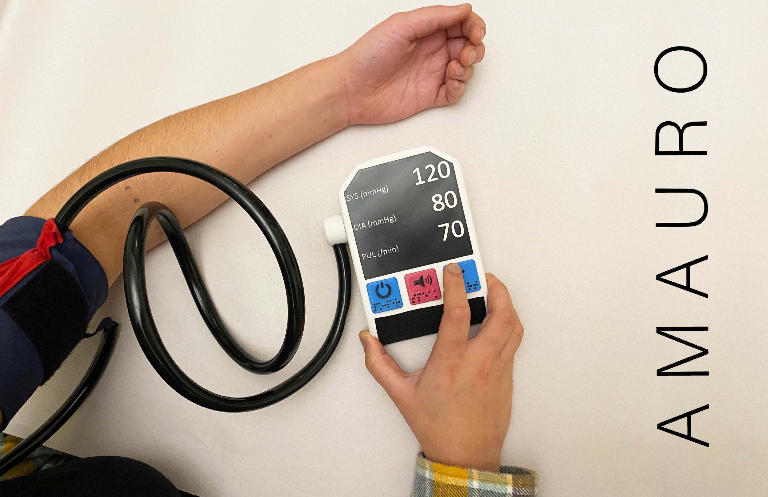
Amauro is a functional, efficient, and accessible blood pressure monitor designed to help those with visual impairment take their blood pressure with ease. Although the target market is those with visual impairment, this product can also be used by anyone. It’s many tactile features, including braille, raised button symbols, textured battery cartridge, audible instruction, and fabric indicators on the cuff, allow for the user to easily use the machine, and understand the different features and their functions. All these features and more allow Amauro to be a blood pressure monitor that is fully accessible to the visually impaired.
Basic Research
-

Manuel Monitor
Two versions, one using mercury and one using the aneroid method.
Manual hand pumps are involved.
No electrical components.
-

Automatic Monitor
Found in homes and hospitals.
Almost completely automatic.
All are electronic devices, either use batteries or an outlet.
-

Cuff-less Monitor
Mostly incorporated into fitness watches and smartwatches.
Not as accurate.
New technology.
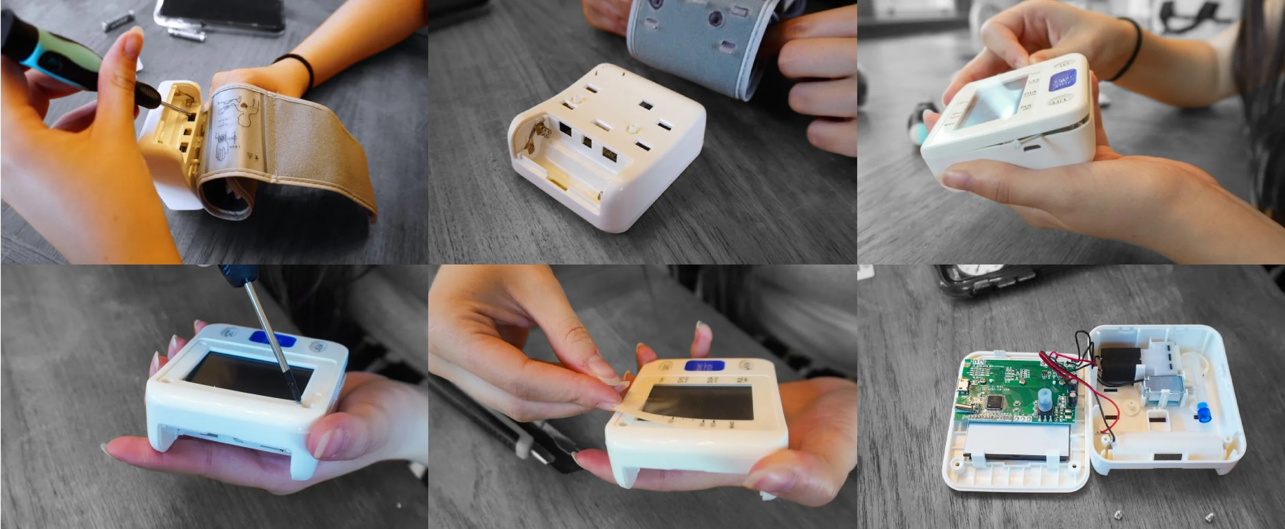
Tear Down Research
-

External Tear Down
-

External Tear Down
Some Notable Features
1. Plastic housing
2. Wrist band
3. Circuit board
4. Screen
5. Motor pump
6. Solenoid
7. One-way valve
User Testing
-

After placing the glasses on, all the users immediately started feeling for the machine to feel for the buttons to try and discover what the buttons and other features did when pressed.
-

Users would then usually press the very left button. Some felt the power symbol and used it as an indicator while others just started clicking. The feedback I received was they would likely feel for the buttons more if they were more prominent.
-

Then based on the instructions given, the user would continue to place the cuff on their arm and proceed to activate the test. After the test was finished, they would go along following more instructions then eventually remove the cuff.
Further Ideation
-
Layout

-
Shape

-
Cuff

Features
Screen
Originally I wanted to have a custom screen, but that would drastically increase the price. After some research, I decided to use custom cut glass with an LCD (liquid crystal display) screen which is smaller than the glass. Using this method the price remains very reasonable and the only downside to this technique is that parts of the screen will not be able to light up. To counteract this, the text/results will be white on a black background. This makes the black background, where there is no LCD, appear more high quality.
Battery Pack
For the power source, I opted for two AA batteries. In order to make this portion of the product accessible, without using audible instruction, I decided to have the batteries pop out of the machine when you click on the plastic battery holder. The external push part is textured plastic so it’s easier for the user to identify, and the container inside has the classic springs found in most battery packs which indicate to the user which way the batteries face. To put the batteries back in, the same push and click method is used.
Buttons
Using the website coolors.co, I managed to find the best shades for the product that remained accessible to those with color blindness. The website allowed me to see what the colours I chose would actually look like with the different forms of color blindness. I also needed to make sure these shades were relatively accessible against the black symbols. I used the website colourcontrast.cc to make sure my shades passed. I also added braille and textured symbols as well for those who can’t read braille. This way the user can navigate purely by touch.
Cuff
I used the same website coolors.co for the two colours I used on the cuff. This time I’m using the red shade as an accent colour to help the user navigate where the cuff should be placed on their upper arm. This strip of fabric is also significantly softer to add a tactile indicator, it is made of cotton and the rest of the cuff is made of nylon. The cuff is permanently attached to the machine for simplicity purposes. There is also a handle that is larger than the D-ring so the cuff has a less likely chance of going out of the D-ring which makes it easier for the user to navigate as well.
Final Model Construction
Machine Construction
I used a variety of techniques to make the final mode. For the machine body, I used foam which I cut on the band saw and sanded on a belt sander and also by hand. I then used Drydex and Gesso, sanding between each layer, to create a smooth plastic textured exterior. The screen was printed on high gloss cardstock, and the speaker was just glued fabric I found in a bag of fabric scraps. The buttons were done in Solidworks and then 3D printed and painted by hand. The parting line was done using tape and white paint, cut very thin, and placed on the model. The battery pack on the back was done using the same technique.
Cuff Construction
For the cuff I used some tubing for both the part that attaches to the machine as well as the handle on the cuff. The fabric I used was nylon because it has no stretch and the red fabric indicator is cotton. Velcro is also used to hold the cuff together during the test. The D-ring is made of acrylic, I used a heat strip machine and a foam jig to get the curves in the acrylic rod.


